Enhancing UX of Art Station
Creating a seamless experience when browsing through the art works
Project Date
2020.03
Type
Individual Project
Instructor
None
Toolkit
Adobe PS, AI, XD
What is ArtStation?
Artstation
ArtStation is the leading showcase platform for games, film, media & entertainment artists.
I have been using ArtStation for about two and a half year. The website contains many interesting artworks, most of them are related to computer graphic and conceptual art. Unlike the Dribble and Behance, which I also enjoy to browse, Artstation often makes me confused and frustrated because of some UX problems people will encounter.
This project is not about rebuilding the website the other way around, but to fix some UX issues and visual design.
Current Design
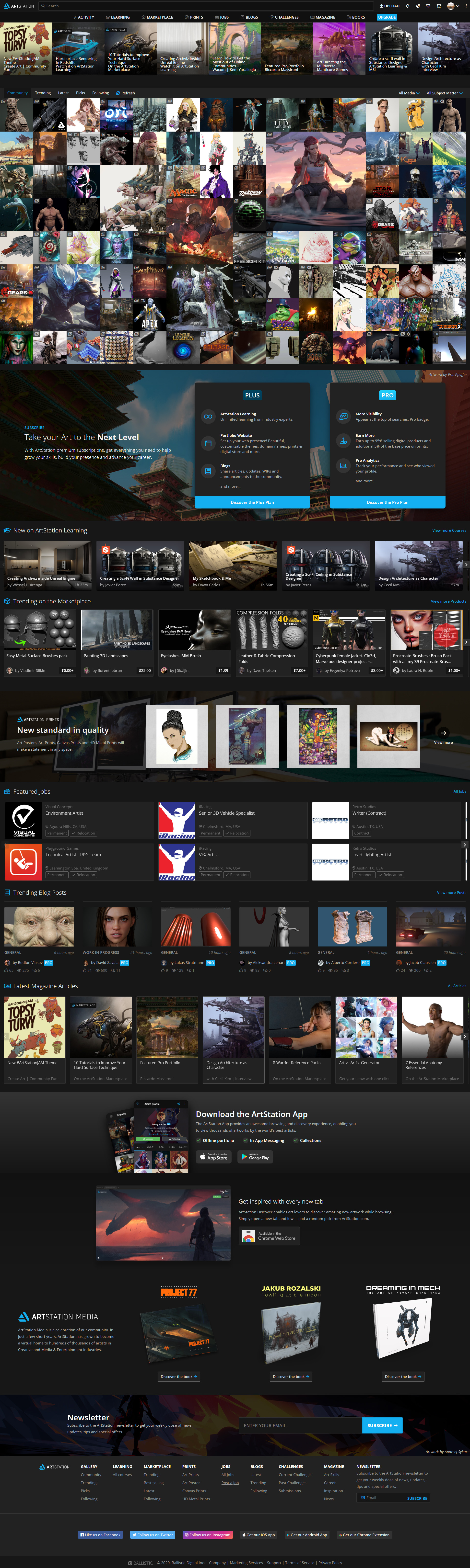
Home Page
So many elements on a same page.
The home page can be divided horizontally into many parts, but each of them shares different logic, which make this "content-abundant" website even more confused and distracted.
When I first see this website, I feel like the website is similar to some Macau casinos...
Lets get started to change the situations and make some improvement.
UX Improvements
Hero Heading

Heading
-
Problem
The ads from other categories are mixed together, leaving no margins, and the description text is too obscure to understand whether the item is a course or a tool.
-
Solution
Create a hero section for the homepage. In this way, we can show more information about the items and leave more space for the artworks below.
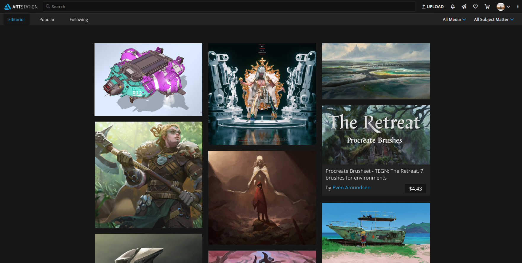
Artworking Browsing
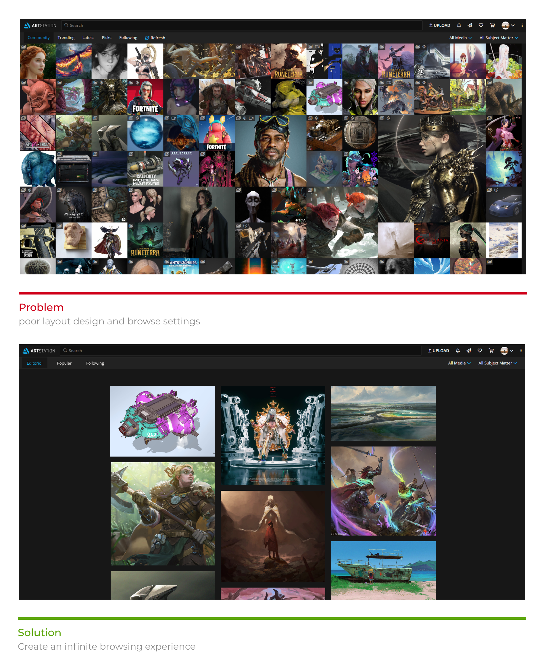
Browsing Artworks
-
Problem
The artworks is huddling, leaving no space between each other. If some one has browsed through all images, he has to go back to the top, and click "refresh".
-
Solution
Leave more space to the left and the right side, make artworks bigger, and create a infinite browsing experience.
Browsing Artworks
-
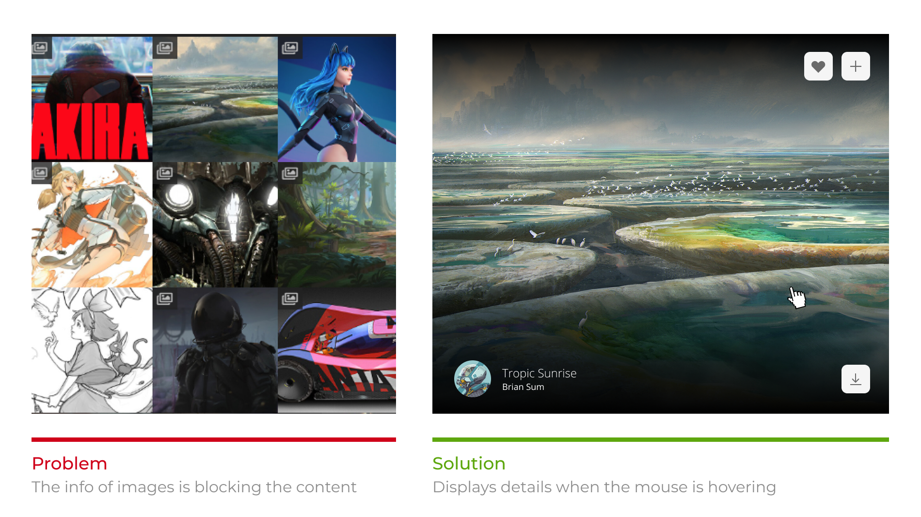
Problem
The detail info of the image is permanently hovering on the top of them. The picture is small, so that it becomes more invisible.
-
Solution
Displays details when the mouse is hovering based on the enlarged image.
Advertisement Settings

Ads in art
-
Problem
Too many section with different styles.
-
Solution
Intersperse the browsing with ads.
Switch Images
Switch Image
-
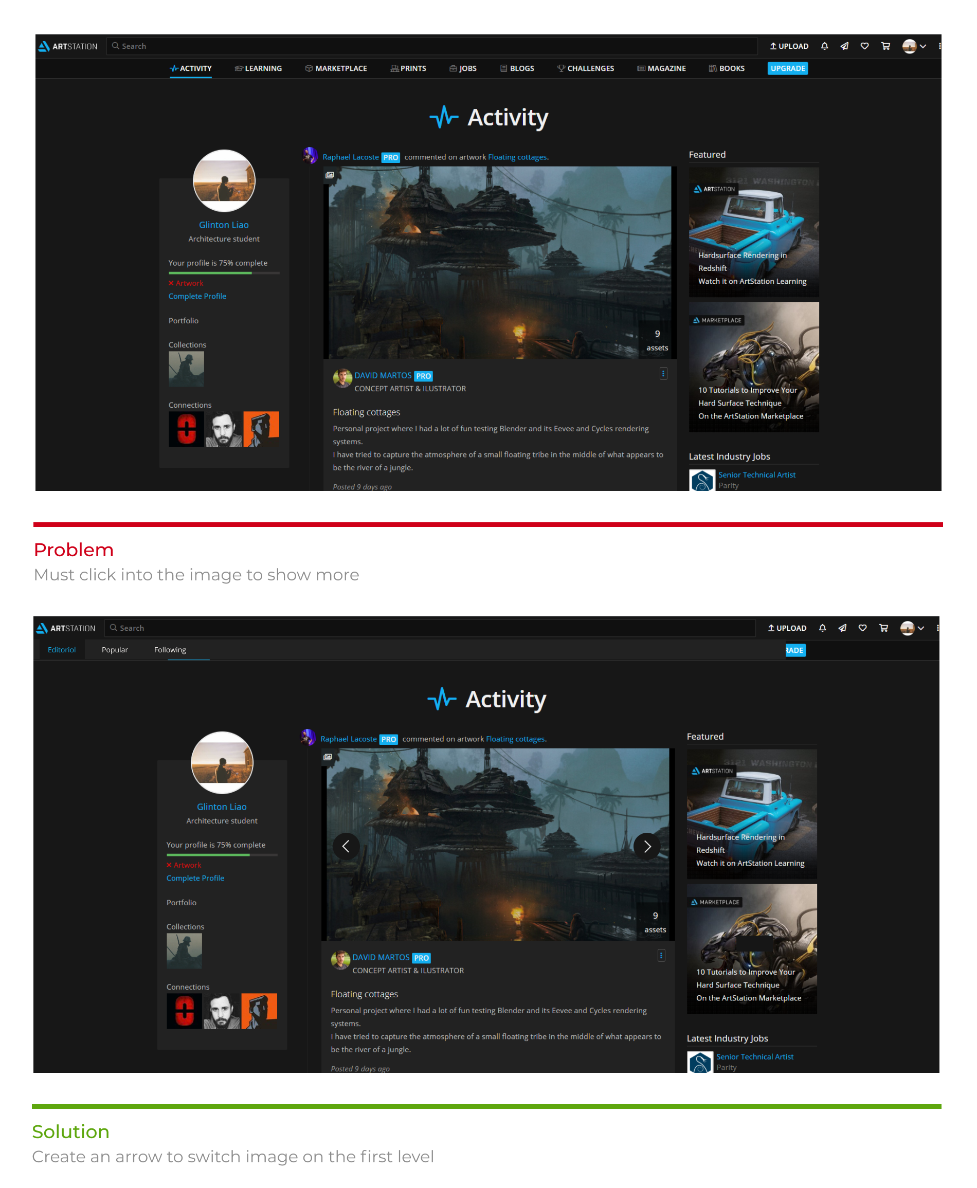
Problem
When a set of works has multiple pages, you must click in to switch between different pages.
-
Solution
Add a toggle button and you can change pictures without having to click in.
Comment Section
Comment Section
-
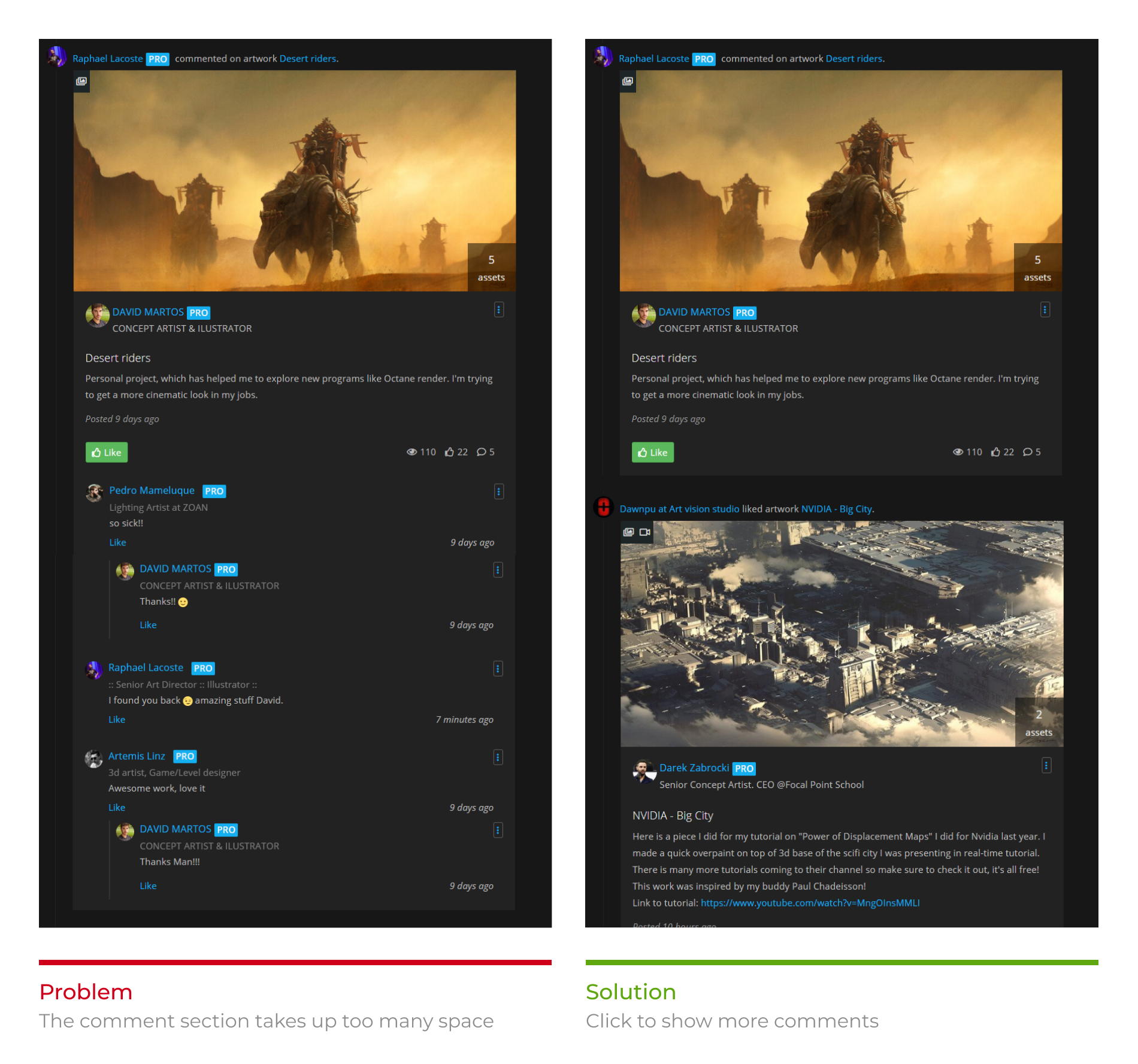
Problem
The comment section, which is open by default, takes up a huge amount of space, larger than the work itself.
-
Solution
The comment section is closed by default, and users can click to open it if they want to.
Ending notes
It was a fun project and I wish Artstation engineers implement some of these features real soon. Also a reminder, I do not work for Artstation, nor was I contracted for this project. I did this project purely out of interest and desire to solve problems I often face.
Thank you for watching!